Buff Bunny is a vibrant, playful brand targeting fitness enthusiasts with a fun twist. For this project, I was tasked with designing packaging for their line of protein powders in three distinct flavours. The goal was to create a bold, instantly recognizable shelf presence that would resonate with a younger, health-conscious audience, while maintaining a premium feel.


Design Process
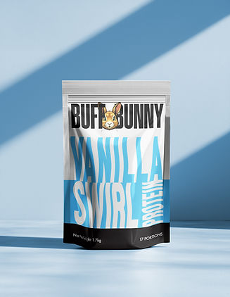
I explored multiple design directions, ultimately leaning into a minimalist layout that highlights bold typography and strong color-coding for flavour distinction. The name of each flavour became the hero, exaggerated in size and interaction, with the type wrapping around the pouch to create a sense of dynamism and energy.


Visual Identity
I chose a bold, modern sans-serif typeface to reflect strength and clarity. The stretched and stacked treatment gives the product a punchy, energetic personality.
Each flavour has a unique, eye-catching color:
Caramel Chaos – Burnt orange and cream for a rich, indulgent vibe.
Choccy Cookie – Pink and white, bringing a playful, dessert-inspired mood.
Vanilla Swirl – Fresh blue and white, evoking purity and freshness.
The Buff Bunny logo features a stylized rabbit that adds a friendly, approachable face to the brand, helping it stand out in a crowded wellness market.