Flourish Nutrition is a wellness brand created specifically to support women diagnosed with HPV through natural, holistic remedies. I was responsible for developing the entire visual identity from concept to completion — including logo design, brand color development, packaging, social media content, and full print-ready artwork.


Design Process
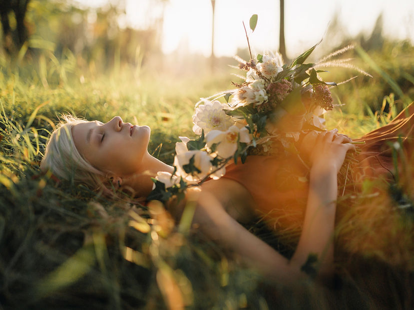
The branding was deeply rooted in the purpose of the products: to offer women a natural, empowering solution at a vulnerable time in their health journey. Flourish Nutrition represents healing, growth, and self-care, embodying a holistic approach to wellness that supports not just the body, but the mind and spirit as well.
Deliverables:
Logo design and brand guidelines
Full product packaging and print-ready artwork
3D product mockups and renders
Instagram feed design and content plan
Visual tone of voice and brand story development


Visual Identity
Logo Design: The logo features a delicate, flowing figure that symbolizes vitality, feminine strength, and renewal. Modern, clean typography balances the emotional softness with a sense of credibility and professionalism.
Color Palette: A soft, nurturing palette of lavender, blush pink, and airy blues was chosen to reflect calmness, compassion, and trust. These hues create a safe and hopeful space for the brand, differentiating it from more clinical or sterile supplement brands.
Packaging Design: The packaging is clean and minimalistic, emphasizing purity and natural wellness. Pastel accents help distinguish between product ranges while maintaining a cohesive visual identity. The designs focus on clarity and emotional reassurance, ensuring that users feel cared for at every touchpoint.
Social Media Aesthetic: Instagram content carries a gentle, uplifting mood, blending product imagery, affirmations, and lifestyle photography. The goal was to foster emotional support alongside education, building a community rooted in positivity and holistic healing.