Design Process
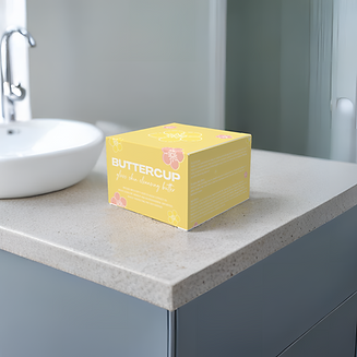
I started by diving into the brand's essence—playful yet sophisticated, luxurious yet fresh. The buttercup flower became the visual centrepiece, symbolising brightness, softness, and natural beauty. I sketched out floral motifs that balanced a minimalistic line-art style with a soft, approachable feel.
Colour played a major role in communicating the brand’s personality. I selected a buttery yellow as the primary brand colour, evoking optimism and warmth. Accents of soft pink and white added a youthful, high-end feel without veering into overly girlish territory. This pastel palette keeps the aesthetic polished yet lively.


Visual Identity
The box features playful floral illustrations on all sides, with the logo prominently displayed for strong shelf appeal. I carefully considered shadow play and light reflections in the final mockup photography to highlight the packaging's tactile matte texture and luxurious print finish.
For the face cream jar, I continued the same design language: a minimal glass container with a metallic cap featuring an etched floral imprint, ensuring consistency and elegance when the box is opened.
Final Outcome:
The result is a high-end packaging system that feels joyful, luxurious, and perfectly aligned with Buttercup's brand promise: glowing skin and a touch of natural magic.