Design Process
I was responsible for the full creative development of So...? Sorry Not Sorry, a vibrant sub-brand under So...? Fragrance. My role encompassed initial concept creation, logo design, brand colour palette development, product packaging, and final print-ready artwork for the entire range.
So...? Sorry Not Sorry was created to appeal to a bold, youthful, and unapologetic audience who embrace self-expression, self-care, and individuality without compromise. The core message — being "So Not Sorry" — is about celebrating confidence, positivity, and playful rebellion.


Visual Identity
The visual language of the brand was designed to reflect its lively, fun-loving spirit.
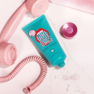
Logo Design: Bold, rounded typography mixed with playful accents and dynamic layout creates a sense of energy and approachability.
Colour Palette: A high-contrast blend of bubblegum pinks, punchy oranges, electric blues, and soft lilacs was chosen to evoke joy, vibrancy, and a fresh, modern appeal.
Packaging: Each product features quirky, conversational product names and bold type treatments to immediately connect with the audience's sense of humour and self-assurance. Playful iconography and unexpected textures (like faux milk cartons for bath milk) bring an extra level of fun and creativity to the unboxing experience.
The copywriting supports the branding with witty, cheeky product names such as Feed Yo' Body, Don't Be Gel, Milk Vibes, and Lookin' Good. The language is confident, casual, and perfectly tuned to a social media-savvy audience.